HTML and CSS3
index.html
- All web project will by default look for a file called index.html
HTML Basics:
- Html stands for Hyper-text Markup Language
- It's a core Web technologies a long with CSS and JavaScript.
- It's used to describe what the content on a web page.
- Html is not a programming language, its a Markup Language as we use it to describe something.
- Html makes use of elements that describe different content such as paragraphs, links, headings, image etc.
Semantics HTML:
- Semantics HTML means that a certain HTML element has a meaning attached to it.
- When it comes to elements, we should focus on what the element means and not what it looks like.
- Not All elements are Semantics such as <b> and <i>.
- Before HTML5 the div tag was used to create empty box to group and divide content, however, div has no semantic meaning and should be avoided.
- There are several reasons why we want to use elements that have semantic meaning.
- search engine optimisation: search engines will better understand our webpages.
- accessibility: can help screen reading technology better understand our page.
What is CSS:
- CSS stands for Cascading Styling Sheets.
- CSS is another core technology of the web.
- While HTML describe the content of a page CSS is used to describe the visual style and presentation.
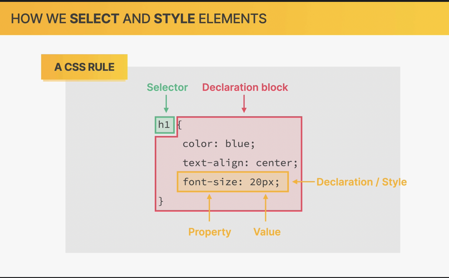
CSS fragment:
/*
 * h1 selector for every h1 element on the page.
 */
h1 {
   color: blue;
   text-align: center;
   font-size: 20px;
}
- In CSS to apply styles we always need to use a selector.
- Styles are declared as a property value pair.
- A group of style Declarations create a Declarations Block.
- The combination of a selector + Declarations Block create a CSS rule.
CSS placement location:
- There are 3 places (types/locations):
- Inline CSS: this is done via the use of the style attribute on every element, this method should be avoided.
- Internal CSS: this is done via the use of the <style></style> tag within the <head></head> tag, this method should be avoided.
- External CSS: this is done via the use of external .css files, these files are then included via the <link href="<location of .style file>" rel="stylesheet"/>
this method is the preferred way
CSS Colours:
- The most traditional model to represent colour is the RGB model.
- In RGB model every colour can be represented by the combination of Red Green Blue colours.
- In the RGB model Red = 255, Green = 255 and Blue = 255 will create white
- In the RGB model Red = 0, Green = 0 and Blue = 0 will create black
- In CSS we have two ways of representing the GRB model.
- RGB/RGBA notation:
- RGB: this notation makes of the rgb(0, 255, 255) function within css.
- RGBA: A stands for alpha which control the transparency, rgba(0, 255, 255, 0.3) = a given colour with a given transparency.
- HEX-DECIMAL notation: this notation we dont make use of the rgb(..) functions, in stead we use a scale from 0 to FF which translates into 0 to 255 in base 10.
For example #00ffff, this notation is the preferred notation.
Pseudo-Classes:
- Pseudo-Classes can be used to change CSS properties based on a state as well a html structure.
- We should use Pseudo-Classes where applicable over JS.
Pseudo-Element:
- Pseudo-elements are elements that dont actually exit in the HTML source code but can be selected and styled in CSS.
- An Example of a pseudo-elements are like the first letter of a paragraph or even the fist line of a paragraph.
5 Rules of CSS:
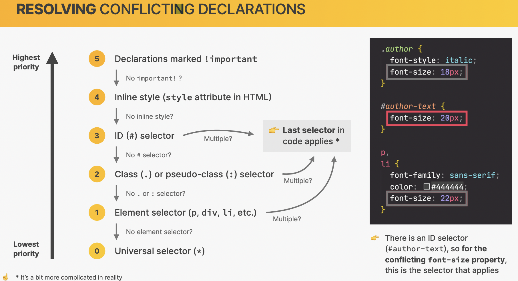
1) Multiple Selectors:
- When we have multiple selectors all rules to the same element all rules will be applied,
however, if there are conflicting CSS properties between the rules, property order kicks in.
- Id selectors have the highest priority, if there are multiple Id selectors then the last rules properties get applied for conflicting properties.
- Class or Pseudo-Class selectors have the 2nd highest priority, if there are multiple Class or Pseudo-Class selectors the last selectors properties will get applied for conflicting properties.
- Element selector if there are multiple element selectors the last selectors properties will get applied for conflicting properties.
- Universal Selector (*) has the lowest priority out of all selectors, however, its primary use case is apply properties that cant be inherited to all element.
- The above priority rules are valid for when CSS rules are described in an external CSS class.
- In-line styles via the styles attribute has higher priority the CSS rules defined within an external CSS file - however, we should never use in-line styles.
- As a last resort we can use the important! declaration, however, this is a hack and should be avoided.
2) Inheritance:
- Inheritance within CSS is a mechanism by which some styles (properties) get their values inherited from parent elements to child elements - Inheritance only makes sense when we're talking about element selectors.
- Not all properties are applicable for inheritance, most properties about text can be inherited.
- Inherited property is very easily overwritten by any rule which has a value for that same property - this means inherited rules have the lowest priority.
- Inheritance is a very powerful mechanism and can be used to provide consistent stying for child elements for the same parent element.
- For properties that CANT be inherited we make use of the universal selector.
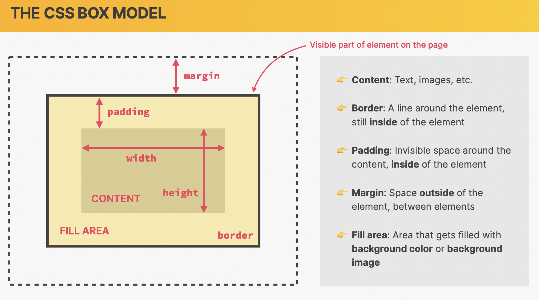
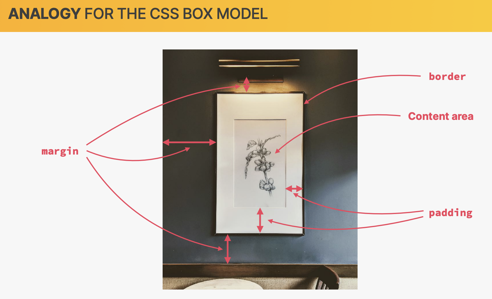
3) Box Model:
- The box model defines how elements are displayed on the webpage and how they are sized.
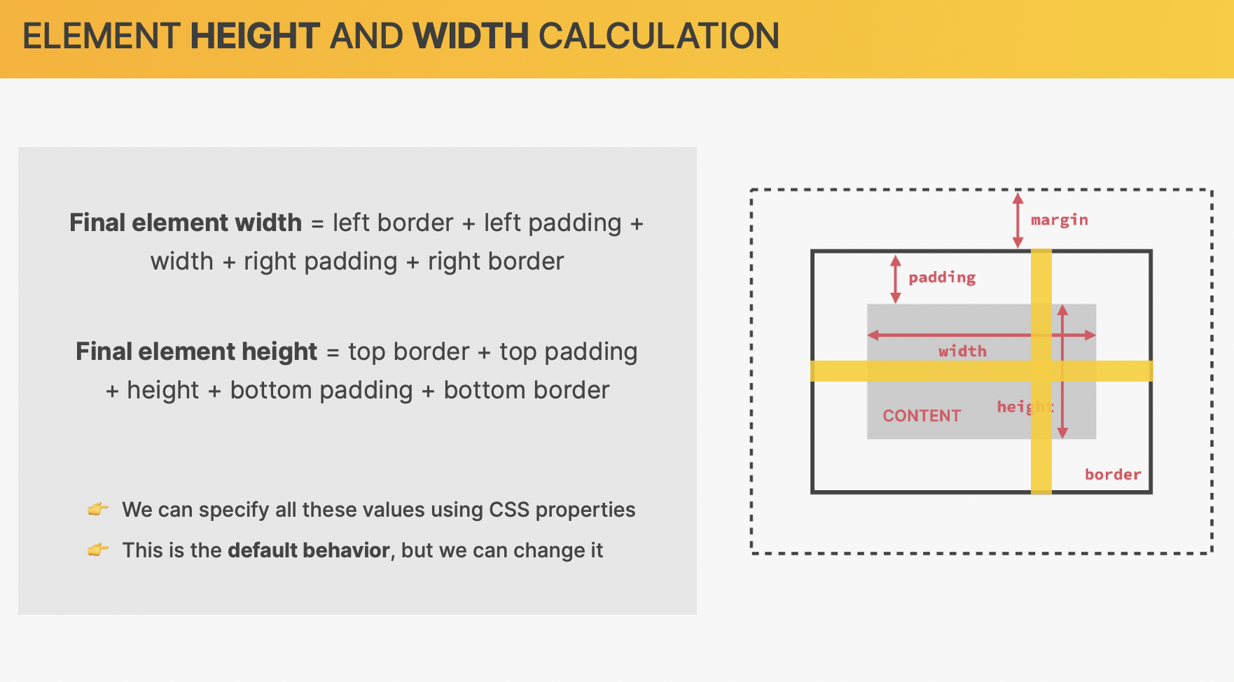
- Every element on a page can be viewed as a rectangular box, each box can have content, a board and space inside and outside of it, all these component are the visual part of the element.
- Content: the stuff within the box, using CSS we can control the contents dimensions height (using the height property) and width (using the width property).
- Border: the boarder goes all around the element. The board is still considered within the element, however, the border is the outer most part of the element.
- Padding: padding is the white space between the content and the boarder. The Padding is still within the box model. Padding is used to create empty space within the element.
- Margin: margin is used to create empty space around the element (outside of the element), in practice margin is used to create space between elements on the page.
- Border, Padding and Margin components are all optional and do not need to be specified.
- content, padding and board component are the visual part of the element.
- The Fill Area (visible part of the element), represent the area that gets filled with background-colour or background-image, this consists of the Content, Padding and Boarder.
- Margin Collapsing happens when two margins share the same space, the smaller margin will collapse and no longer render.
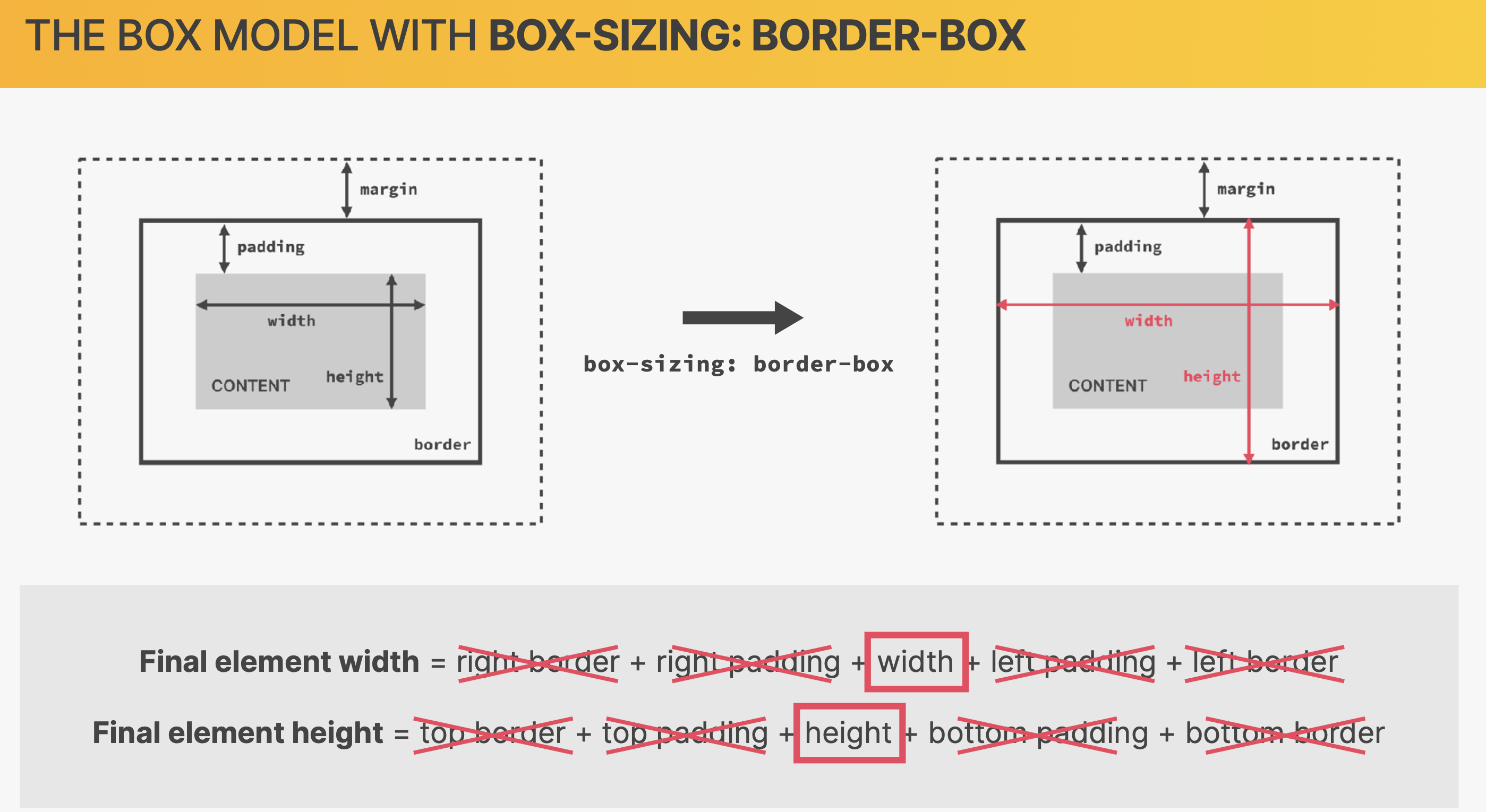
- The Box model behaviour can be changed using CSS to something called Border-Box.
- Border-Box is enabled on a element by setting the box-sizing = border-box
- Border-Box makes the content go from side of the border to the other side, this means the border and the padding share same space,
increasing border and/or padding will reduce the content size automatically.
4) Types Of Boxes:
- CSS has different types of boxes depending on the element:
-
In-Line Box:
- An in-line box is a box where the content occupies the exact amount space they need - the box width and height is the exact size as the contents dimensions.
- These Boxes do not create line-break, this means they can be stacked horizontally (side-by-side with other In-Line elements).
- The In-Line box elements NEVER create vertical space only horizontal space.
- Both Padding and Margins can only be adjusted left and right, top and bottom can be adjusted.
- The widths and height attributes have no impact.
-
Block-Box:
- Also referred to as block-element elements, block-level elements occupy all the width space they can relative to the parent element.
- They in short create line brakes after the element.
- The effect of this is that they can be side-by-side with one another.
- These Box types stack vertically by default.
- Most elements are block level elements.
- Using CSS we can actually change the In-Line boxes to Block-Level boxes using the display property set to the value of block,
we can do the inverse as well.
-
In-Line-Block Box:
- This is a hybrid Box, In-Line-Block Box behave like In-Line Box from the outside but behave Block-Element Box from the inside.
- So what this means, they inherit the In-Line Box behavior of only taking the exact space they need therefore they don't cause line break.
From the Box-Element box they inherit the box model behavior so width, height, padding and margins cant be adjusted same as on Block-Element.
- This box combines best of both worlds.
- The CSS property for this is display = inline-block.
5) Positioning-Modes (Absolute Positioning):
- CSS has several position modes, but there are a few that a more important than others.
- Normal Flow:
- this is the default positioning of element on the page - Position = relative.
- it is said that the elements are in flow, this means that the elements are laid out according to their order in the HTML source code.
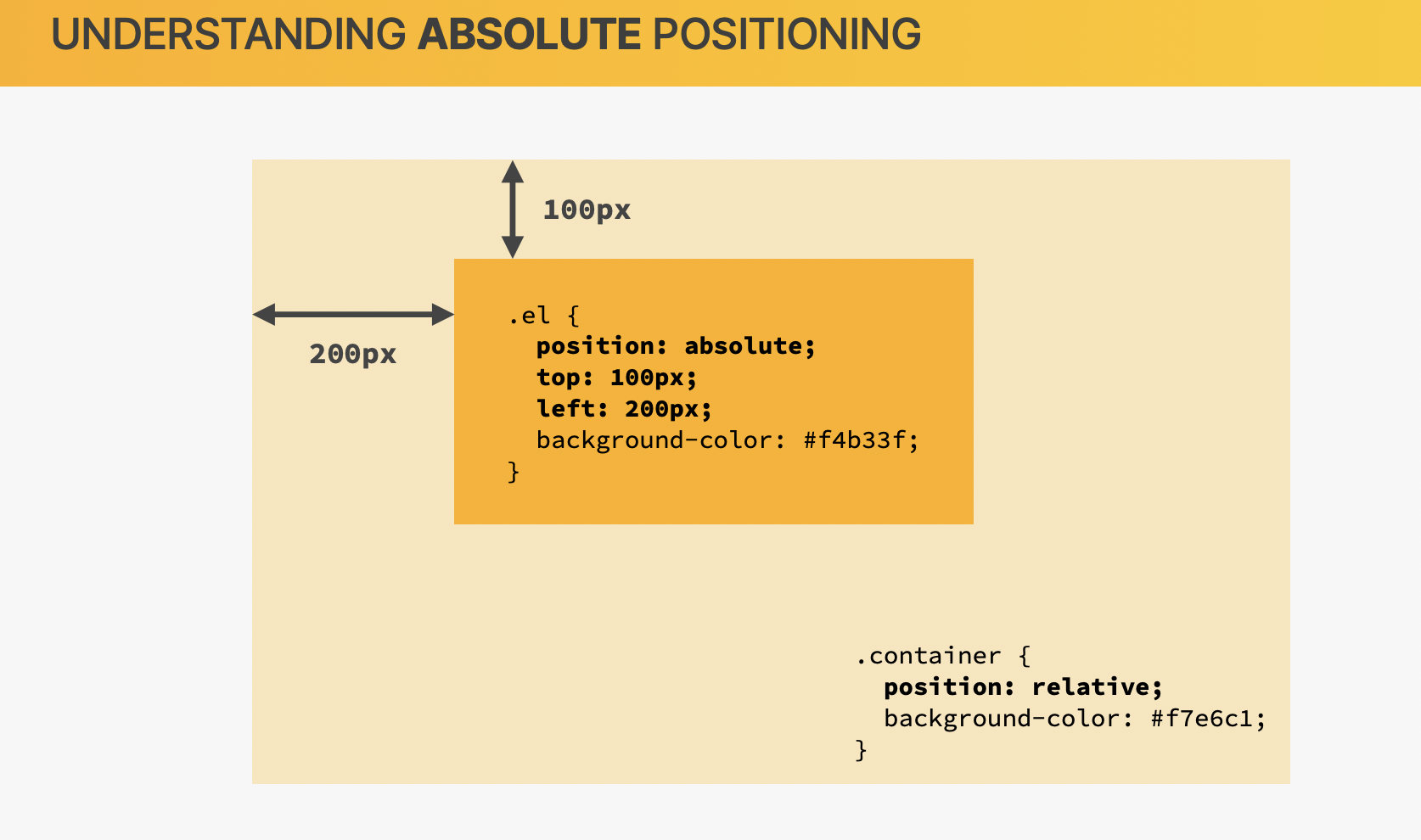
- Absolute Positioning:
- This positioning mode allows us to absolute position elements anywhere on the page - Position = absolute.
- it is said that such elements are out of flow.
- this mode removes the impact of surrounding the elements and can even overlap other elements.
- In this mode the position of the element is relative to the parent container element.
What is a layout?:
- In web design and Web Development a layout is referred to the way different elements on the page are arranged.
- A layout gives the page a visual structure.
- Building a layout is all about arraying page elements into a visual structure, instead of simply having then placed one after another (normal flow).
Types of layouts:
- There are 2 types of layouts:
- Page Layout:
- This type of layout is the arrangement of the components (group or a collections of elements) on the page.
- The larger components themselves will also have some form of a layout arranging their collection of elements.
- Component Layout:
- Component layout is the internal arrangement of the collections of elements that create the large component,
they are arranged to provide visual structure for the component.
Float Layout:
- This method for creating layout is getting outdated and is considered deprecated.
- This is better to make use of Flex Box and/or CSS Grid instead, however, in some cases Float Layout can be used.
Flex Box Layout:
- This Method is a more modern way of building layouts.
- Its primary used to layout elements in a 1-dimensional row, making it great option for component layouts.
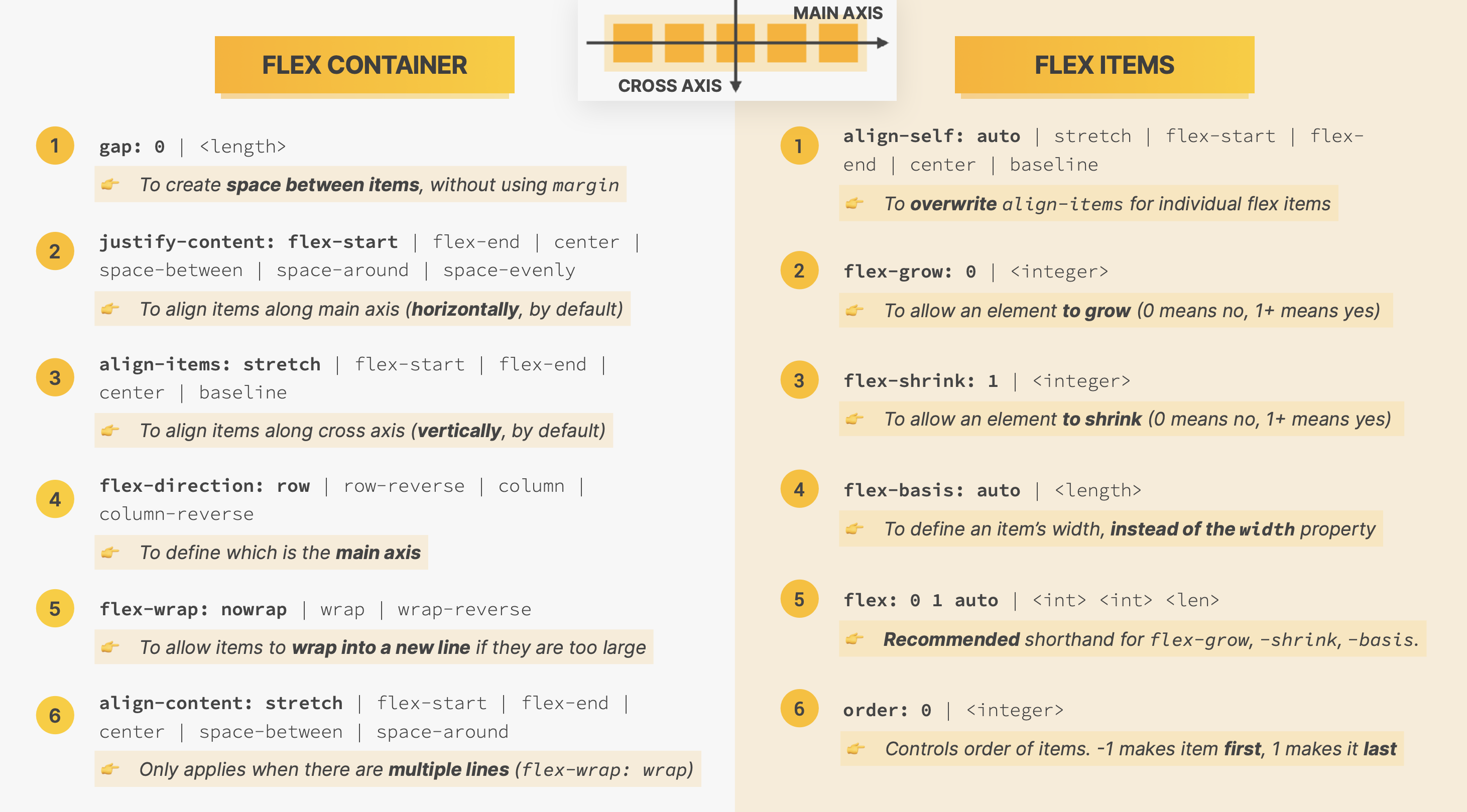
- The most basic definition of a flex box is that it is a set of related CSS properties for creating 1-dimensional layout.
- The idea behind flexbox is that its a collection of CSS properties that can be used to help divide empty space between child elements with a given container - - by using these CSS properties we get the browser to do a lot of heavy lifting work for us.
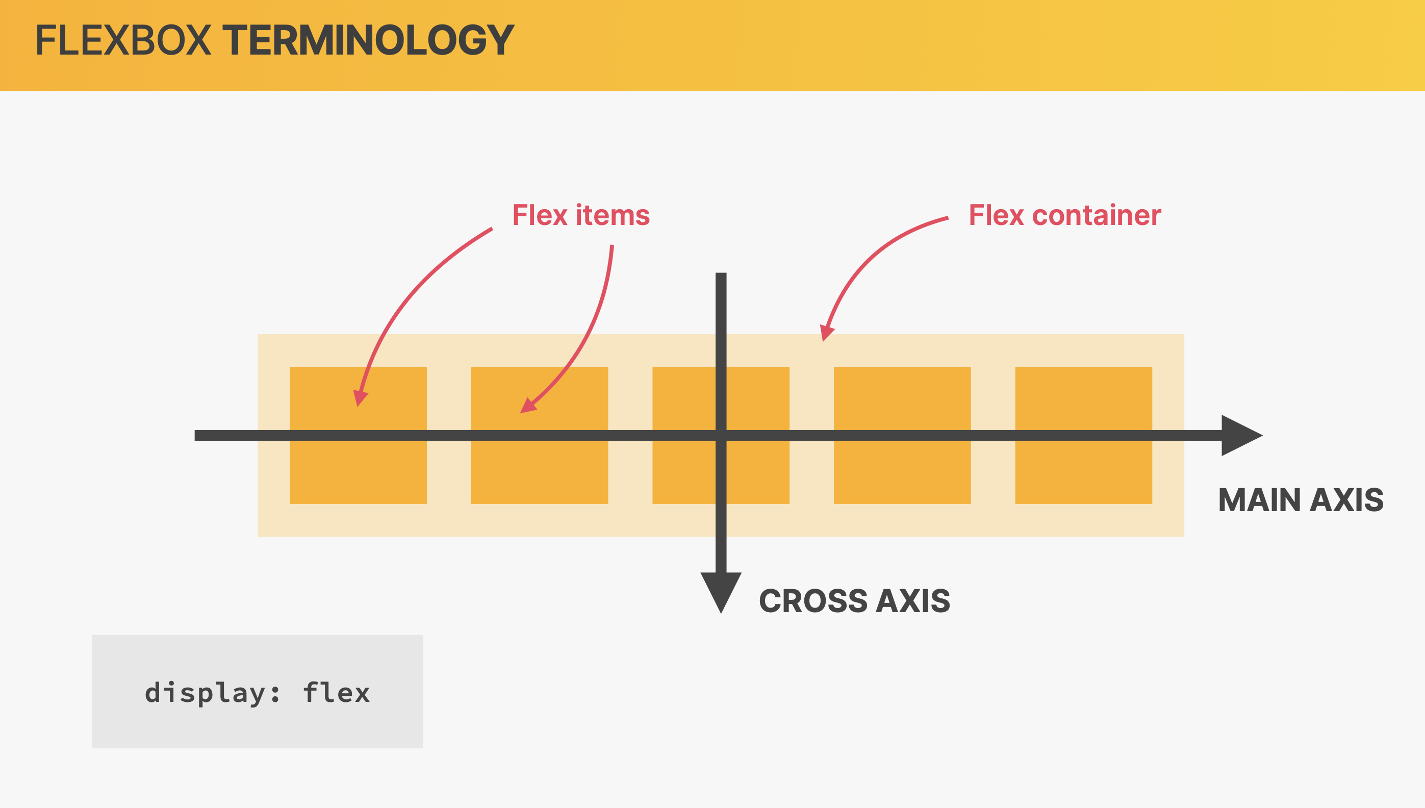
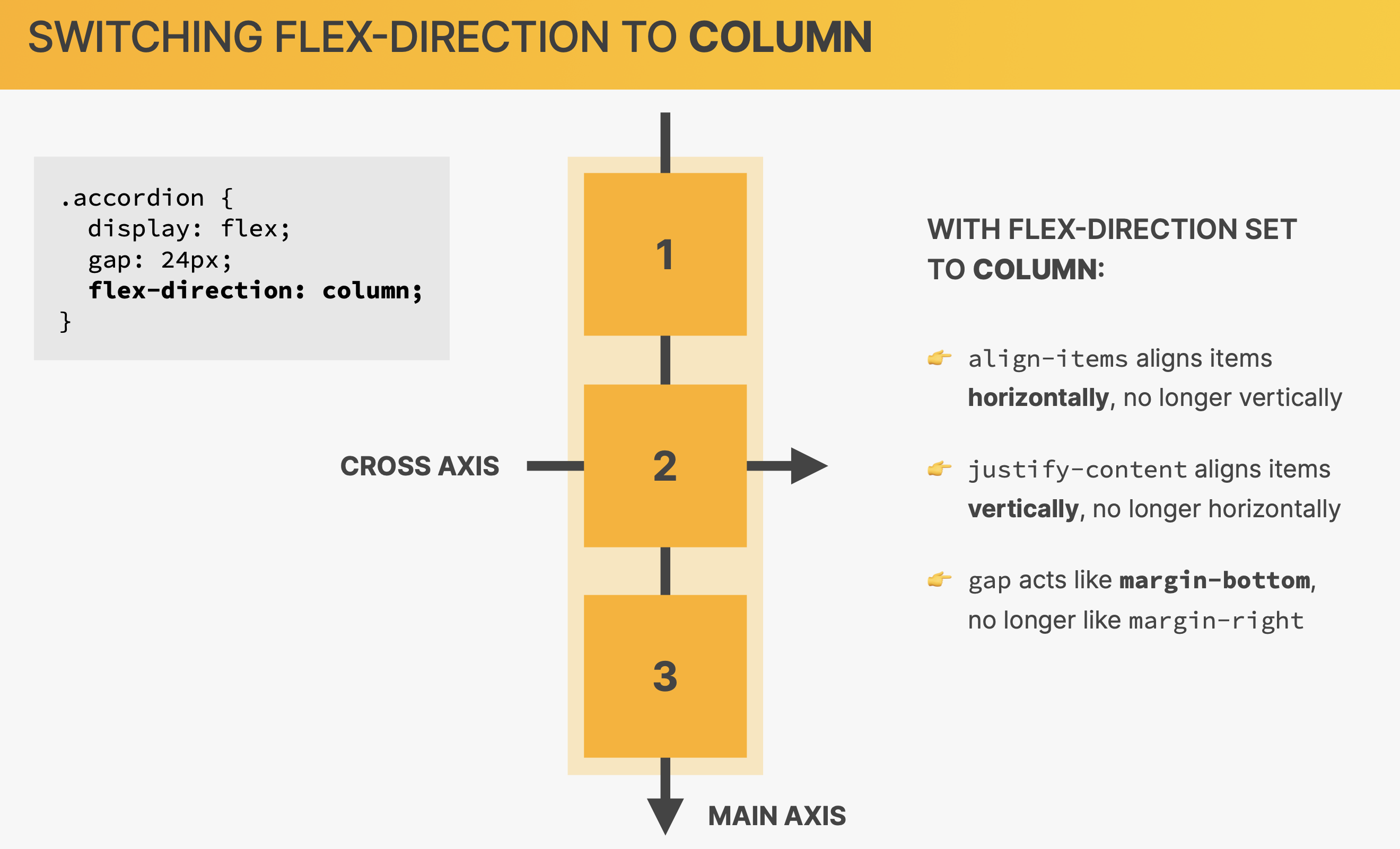
Terminology:
- The element that is acting as the container is called flex container - to create a flex container we just need to set the display property to flex.
- The child elements within the flex container are called flex items.
- The direction the flex items are laid out is called main axis, the other axis is called cross axis.
- The main axis and cross-axis can be inverted. This feature is very powerful as we can create a 1 dimensional table grid.
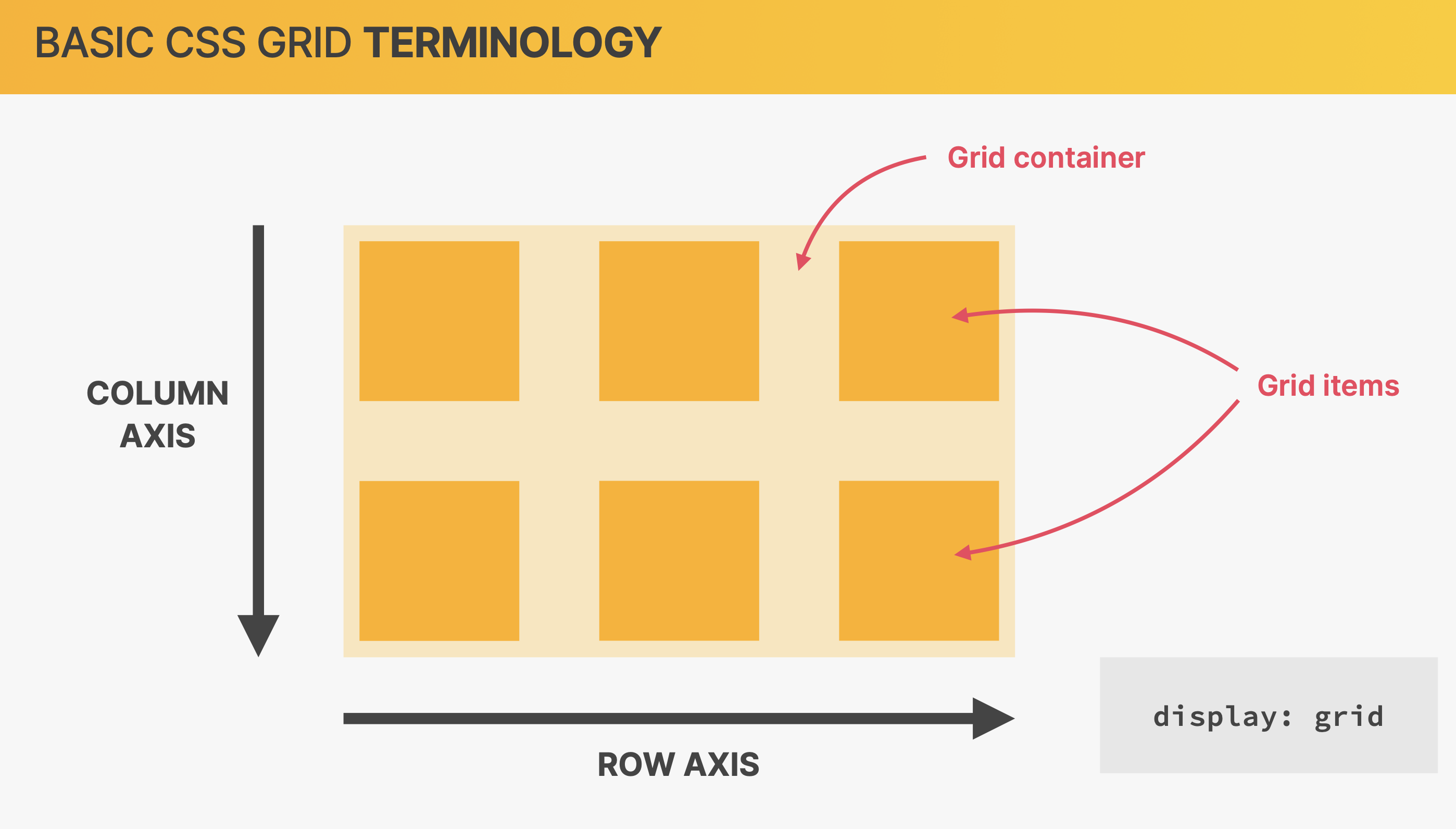
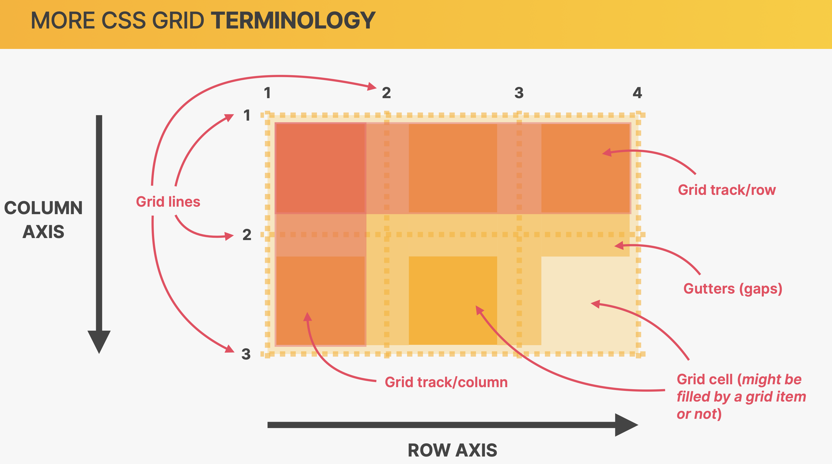
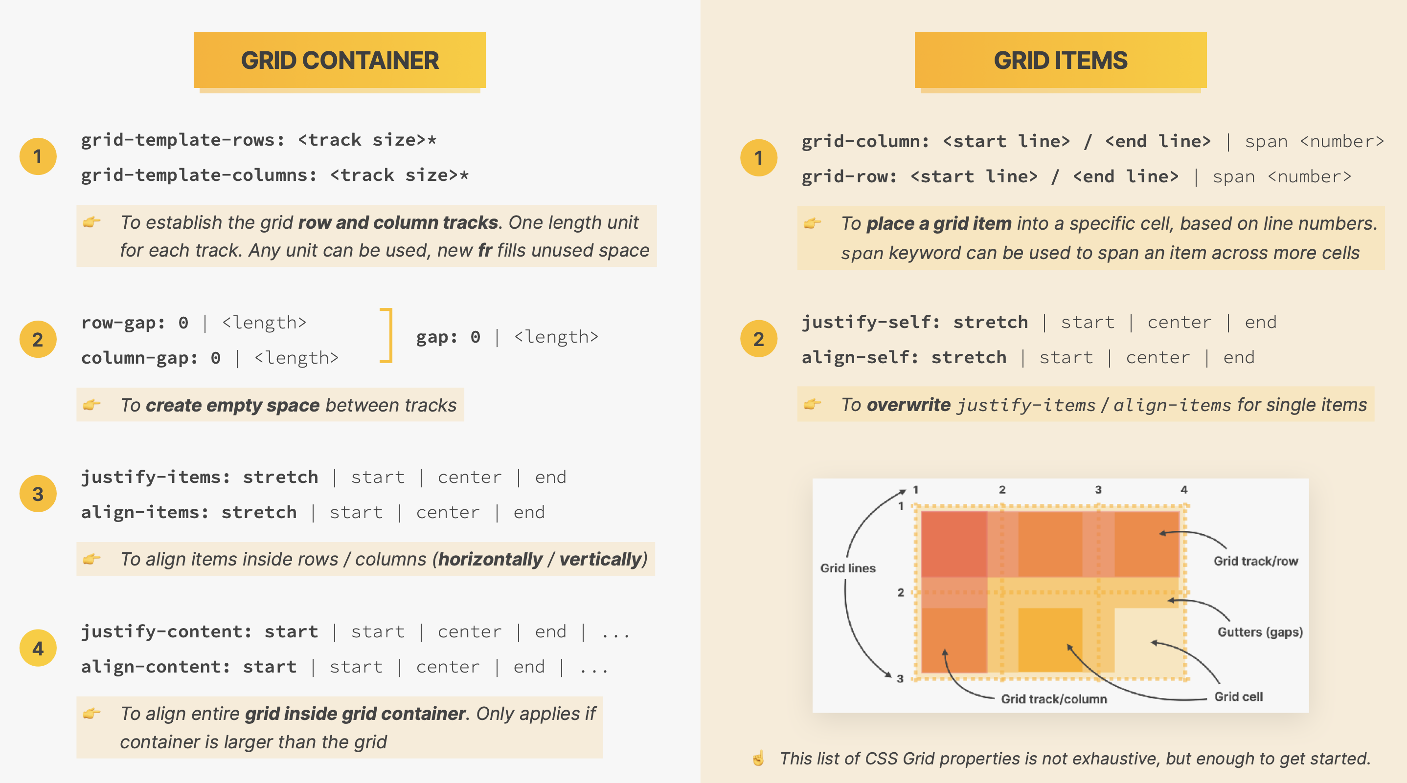
CSS Grid Layout:
- This method can be used for 2-dimensional grid, this makes it perfect for a complex component layout and/or a page layout.__
- The container element is referred to as the Grid Container and the child elements are referred to as Grid Items.
- CSS Grids are set of CSS properties that can be used to create 2-dimensional layouts.
- CSS Grids are used to divide container elements into rows and columns.
Terminology:
- The container element is referred to as the Grid Container
- The child elements are referred to as Grid Items.
- The Grid consists of two axis row axis and column axis.
- The Grid cells are the areas within the were element can fill, cells can remain empty if need be.
- The Grid cells don't need ot be filled entirely, a element can be smaller than the Grid cell area.

 Github site code